Bobby Vault · Phase 0 · Brand approval gate
Three Bobby Vault brand directions
Your important information. Secure, organized and available to the people you trust. Nothing below is canonical: the product blueprint stays unbuilt until the Owner approves one direction.
⚠ Approval gate open — build blocked
No vault, authentication, database, Didit integration, API, MCP, recovery or admin functionality has been implemented. This deployment contains a brand presentation only.
1. Bobby ecosystem research
- bobbyguru.com — reachable (200)
- Dark-first shell (
html.dark), Work Sans display with JetBrains Mono for system/meta text, a preloadedbeeldmerkPNG, and a published/brandbrand book. Governance-led tone. - bobbyguru.com/mcp — reachable (401)
- Returns
{"error":"unauthorized"}. The ecosystem convention is that MCP is a real, authenticated, scoped surface — never anonymous. - bobbyid.com — reachable (200)
- Institutional navy theme (
#0A2540), positioned as the identity layer: “verify once, share only what is needed.” Bobby Vault must sit beside it, not imitate it — hence a distinct vault-door mark and its own cyan protection accent. - bobbydirectory.com — no published build (404)
- Not observable at crawl time, so no conclusions were drawn from it. Recorded rather than guessed.
Shared conventions carried forward: dark-first console, Work Sans + JetBrains Mono pairing, the term beeldmerk for the standalone mark, public /brand, /terms, /privacy, /docs, /api and /mcp surfaces, and authenticated scoped machine access.
2. The directions
Direction 1: Vault Blue
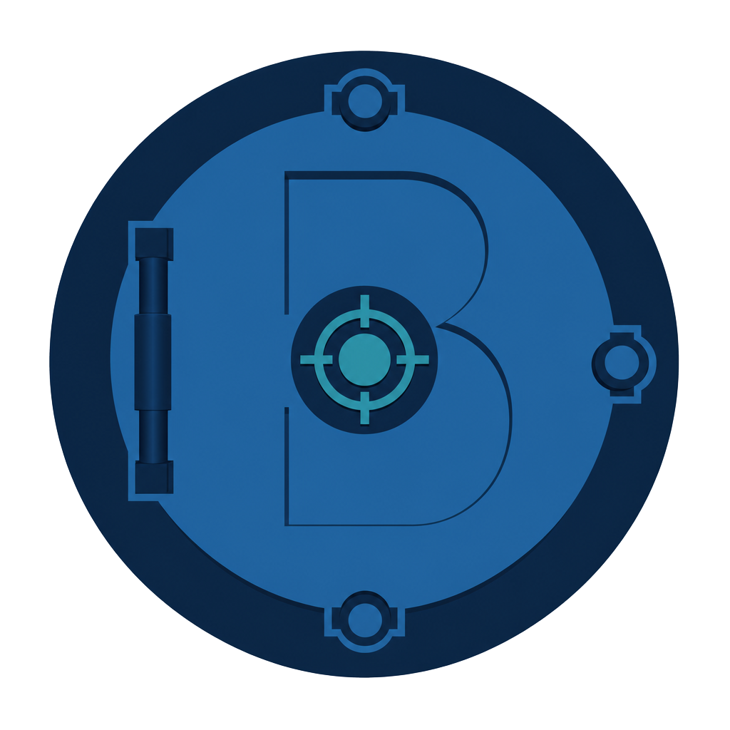
Recommended — not approvedA circular bank-vault door holding a quiet letter B, three locking bolts on the rim and a single restrained centre lock. The mark reads as engineered custody rather than mourning: it is a door you open every day, not one you seal. Closest family resemblance to Bobby ID's institutional navy, while the cyan lock detail keeps Bobby Vault distinct within the ecosystem.
Palette
Vault Navy
#102A43
Primary surface / brand
Security Blue
#1F6FA9
Interactive / primary action
Protected Cyan
#2A8FA3
Accent, protected state
Steel Mist
#E8EEF3
Light background / text on dark
Deep Chamber
#081722
Dark background / console
Logo system — primary, horizontal, stacked, beeldmerk
Encrypted vaults
Dark background & monochrome
Encrypted vaults
Interface applications
Favicon 16 / 32 & application icon
Mobile header test
/console header test
Accessibility contrast results (WCAG 2.2)
| Pair | Ratio | Result |
|---|---|---|
| Vault Navy on Steel Mist | 12.52:1 | ✓ AAA |
| Steel Mist on Deep Chamber | 15.53:1 | ✓ AAA |
| White on Security Blue | 5.38:1 | ✓ AA (normal text) |
| Protected Cyan on Deep Chamber | 4.81:1 | ✓ AA (normal text) |
| Security Blue on Steel Mist | 4.60:1 | ✓ AA (normal text) |
Strengths
- Reads as security infrastructure, not funeral service — matches the everyday positioning.
- Every core pair clears WCAG 2.2 AA; two pairs clear AAA.
- Circular mark survives 16px favicon reduction better than the other two silhouettes.
- Nearest to Bobby ID's navy, so ecosystem kinship is legible without cloning it.
Weaknesses
- Blue security branding is a crowded category; differentiation rests on the bolt/lock detail.
- Protected Cyan at 4.81:1 is AA but not AAA — never use it for small body text on dark.
- The interior B needs a simplified variant below 24px or it fills in.
Direction 2: Obsidian Gold
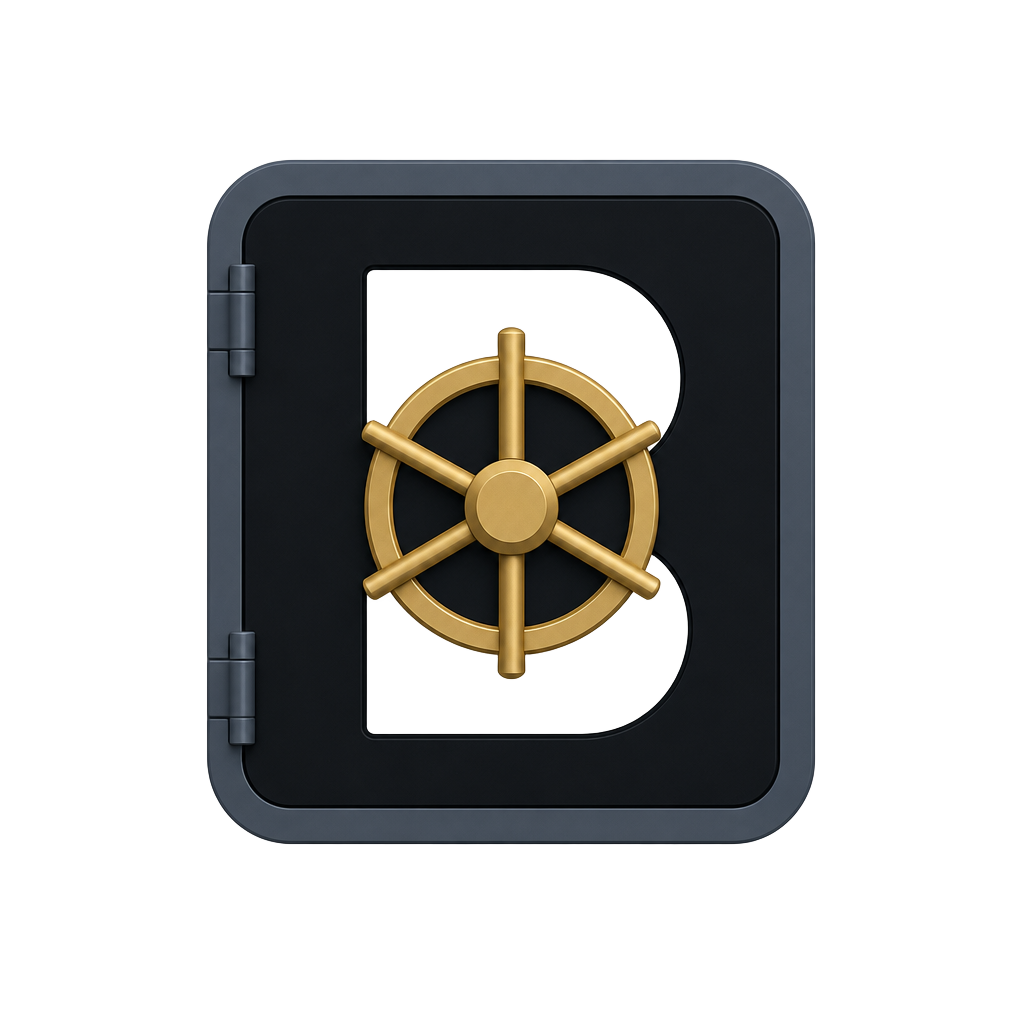
A rounded-square safe door in obsidian with a gold spoke wheel and a negative-space B cut through the face. The tone is private-bank custody: heavier, more ceremonial, aimed at company and crypto vaults rather than family document keeping.
Palette
Obsidian
#111418
Primary surface
Vault Steel
#4C5967
Structure / borders
Security Gold
#C9A85C
Accent / brand signature
Ivory Metal
#F3F0E8
Light background / text on dark
Verified Green
#2D7D63
Verified / success state
Logo system — primary, horizontal, stacked, beeldmerk
Encrypted vaults
Dark background & monochrome
Encrypted vaults
Interface applications
Favicon 16 / 32 & application icon
Mobile header test
/console header test
Accessibility contrast results (WCAG 2.2)
| Pair | Ratio | Result |
|---|---|---|
| Obsidian on Ivory Metal | 16.22:1 | ✓ AAA |
| Security Gold on Obsidian | 8.13:1 | ✓ AAA |
| Vault Steel on Ivory Metal | 6.29:1 | ✓ AA (AAA large) |
| Verified Green on Ivory Metal | 4.36:1 | ✕ Fails AA for body text |
Strengths
- Highest perceived value; strong fit for Company Vault and Crypto Vault contexts.
- Gold on obsidian is unmistakable at app-icon size.
- Clear separation from every other Bobby product.
Weaknesses
- Verified Green fails AA on Ivory Metal at 4.36:1 and would need re-specification before use.
- Luxury tone risks implying a paid tier — Bobby Vault is free.
- Gold degrades to a flat beige in monochrome print and in greyscale fax/scan contexts.
Direction 3: Fortified Green
A shield containing a vault door, with a document sheet emerging at the base. The most literal of the three: protection plus paperwork. It leans toward records management and continuity planning rather than credentials and crypto.
Palette
Deep Vault Green
#12372A
Primary surface
Steel Green
#356859
Interactive / primary action
Mint Signal
#62B99A
Accent / status
Mineral White
#EDF3F0
Light background / text on dark
Black Forest
#071D16
Dark background / console
Logo system — primary, horizontal, stacked, beeldmerk

Encrypted vaults
Dark background & monochrome
Encrypted vaults
Interface applications
Favicon 16 / 32 & application icon
Mobile header test
/console header test
Accessibility contrast results (WCAG 2.2)
| Pair | Ratio | Result |
|---|---|---|
| Mineral White on Black Forest | 15.61:1 | ✓ AAA |
| Deep Vault Green on Mineral White | 11.63:1 | ✓ AAA |
| Mint Signal on Black Forest | 7.46:1 | ✓ AAA |
| Steel Green on Mineral White | 5.70:1 | ✓ AA (AAA large) |
Strengths
- Strongest contrast performance overall — all listed pairs clear AA, three clear AAA.
- Shield plus document communicates the records use case without explanation.
- Green reads as calm and non-alarming for emergency and continuity modules.
Weaknesses
- Shield iconography is heavily used by antivirus and insurance brands.
- Three stacked ideas (shield, door, document) crowd the mark below 32px.
- Green risks colliding with success/verified status colours in the console UI.
3. Recommendation and approval request
Direction 1 — Vault Blue is recommended. It carries the strongest everyday security read without implying death, inheritance or a paid tier; its circular mark holds up at favicon size; and its palette clears WCAG 2.2 AA on every core pair with two AAA pairs. Direction 3 scores marginally better on contrast but its shield is generic and crowded; Direction 2 is the most distinctive but signals premium pricing and has one failing colour pair.
Owner approval required
Direction 1 is recommended, not approved. Reply with the direction number to make it canonical. On approval the next steps are, in order: brand foundation and /brand, then the architecture and threat model, then authentication and the secure Owner bootstrap.
Implementation status — stated plainly
- Implemented: this brand-approval presentation, three beeldmerk assets, three palettes, lockup and interface mock-ups, measured contrast ratios, favicon derived from the Direction 1 mark.
- Simulated: every console, mobile and app-icon frame on this page is a static visual test, not working software.
- Not built: accounts, MFA, vaults, encryption, search, AI search, documents, admin, roles, Owner bootstrap, Didit, recovery claims, API and MCP.
- Assumptions: logo marks are raster at this stage and must be redrawn as vectors before
/brandships; contrast figures cover the palette pairs listed, not yet real screens. - No claims made: nothing here asserts zero-knowledge, end-to-end encryption or any compliance status.